Apryse
Project
Xodo
Industry
Software Technology
Industry
Software Technology
Team Size
15+ Employees
Timeline
8 months+
Tools
Figma, Miro, Jira
Overview
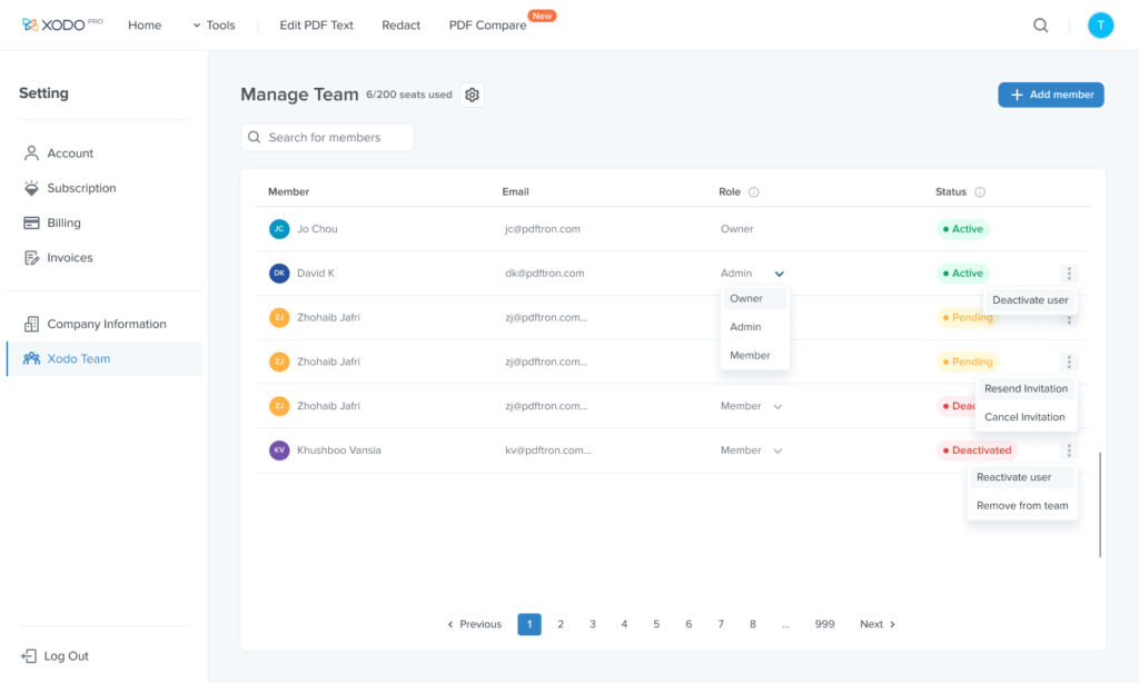
Xodo is an online B2C & B2B PDF tool supporting document viewing that provides free and pro features, enabling users to view, annotate, and edit PDF documents on both web and mobile platforms.
As the project lead, I designed the subscription flow that enabled larger businesses to purchase licenses and create their own teams, giving them access to premium tools. Additionally, I optimized the B2C website layout and tool functionality to enhance both visual appeal and usability, ensuring a more engaging experience for users.
Problem
After reviewing our website pricing page, we identified the need to introduce a Team subscription for businesses and larger groups to access our online pro features. However, to ensure efficient management of the user group, we need to enable admins to invite members to join the Team using different user accounts. How can we develop a user flow that allows admins to effectively manage the user group while ensuring a seamless experience for team members joining the Team?
Goals
As the lead designer, I decided to dive into a research and user journey to map out the subscription process for different account users. This included various functionalities such as sign-up, team setup, member invitation, plan upgrade, and billing system. I aimed to uncover any user scenarios and frustrations and studied on how to increase user engagement with a seamless design to ultimately achieve user satisfaction with payment from team collaboration, data analytics and A/B testing.
Business User
200K+ Increased
User Adpotion
15% Increased
Create a Team
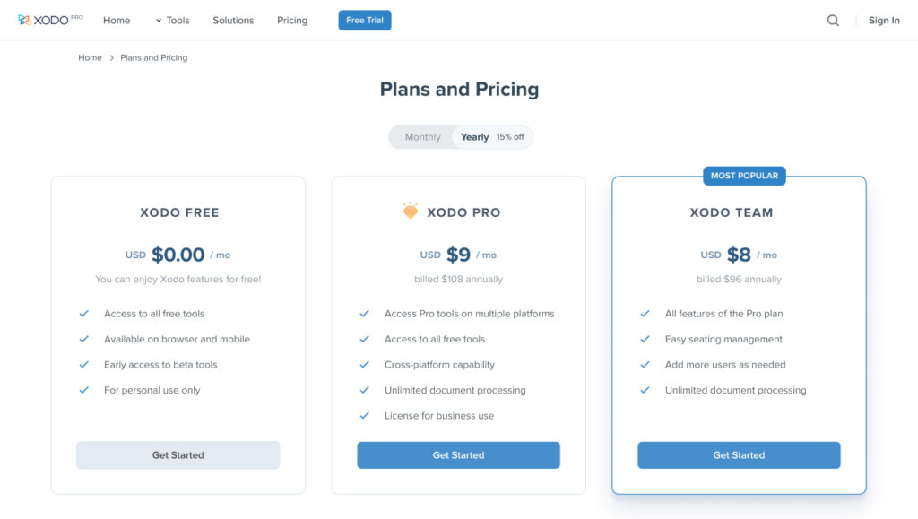
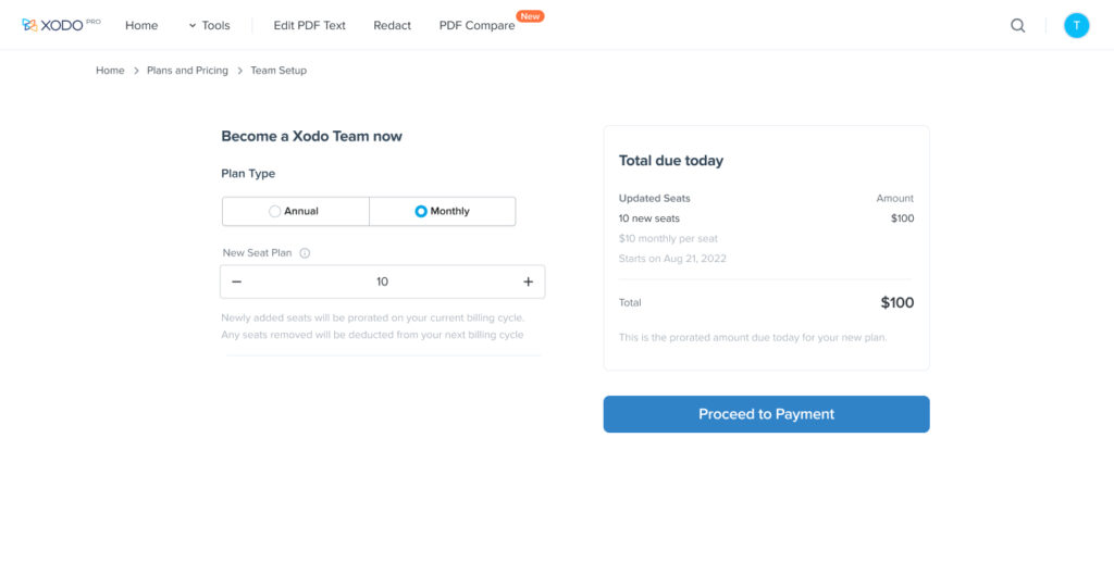
Before diving into the design, it was crucial to understand the Team setup process and how to guide users toward purchasing licenses. I collaborated with the marketing team to analyze the differences between previous monthly and annual purchase histories, and we concluded that users were most interested in seeing the total value of their current plan selection. While we couldn’t be certain this aligned with user expectations, we opted to run A/B tests to validate the hypothesis and determine the best design approach.
Planning on MVP
To gain a better understanding of the scope and features required for our project, I conducted research on what other companies were doing to get ideation and inspiration. Through this research, we aimed to identify the best practices, project constraints, requirement, and MVP features to ensure we incorporated the trends and findings into our own projects.

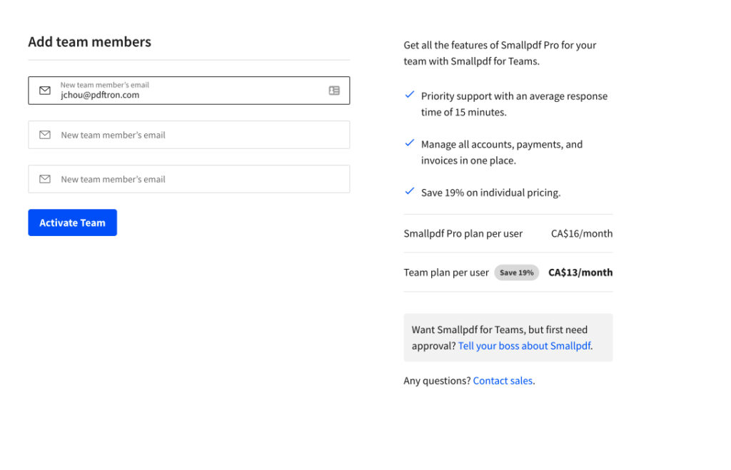
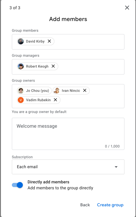
I researched on Microsoft Team Invite, Google, and Small PDF, etc to understand their intuitive design with most clear flow. I conducted a competitor analysis to study how they resolved the complexity with the main features through invitations. I took the notes and shared with the team and learned how to design the best practices and patters to stand out the projects.

Questions to be considered
Can we allow users to sign in from SSO?
Do users need to sign in before getting invited?
How to upgrade plans when member seats are full?
How to notify the available seats when adding new members?
How frequently the admins would upgrade the seats and interact with the member authorization and billing with Team features?
What if the user wanted to change the plan or cancel the plan after they’ve already completed the payment?
User flow and features
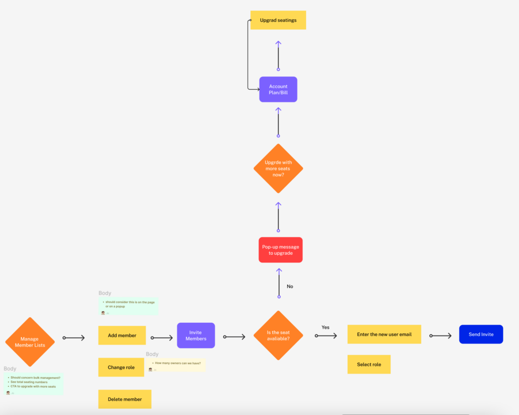
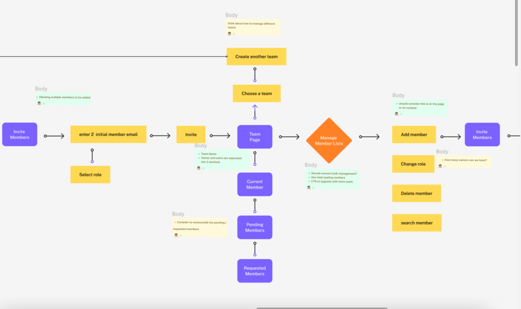
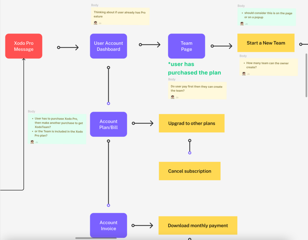
The next step was to map out the user flow for various account types, such as admins and team members, to identify potential pain points and areas for improvement. This process helped us define clear features and build robust interfaces, starting with a seamless user experience, component interactions, and the connections between different actions. The goal was to ensure the platform was intuitive and easy to navigate for all users.
Onboarding
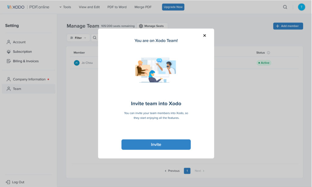
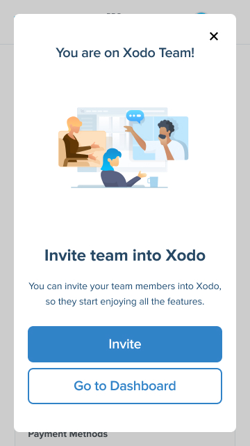
The main challenge was that users might not easily recognize the benefits and values of Team feature or how to access it within the existing product before creating a team. To address this, I designed a pop-up notification—reusing the current design system components—that introduced the Team feature when users signed into our platform via SSO to access Xodo files. This notification prompted users to explore and upgrade to the Team features. This solution not only served as a shortcut to drive user engagement toward the subscription page, but also showcased my ability to make quick decisions, allowing users to quickly understand their goal and start building a team.
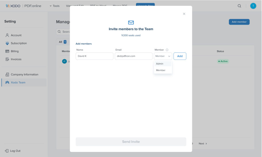
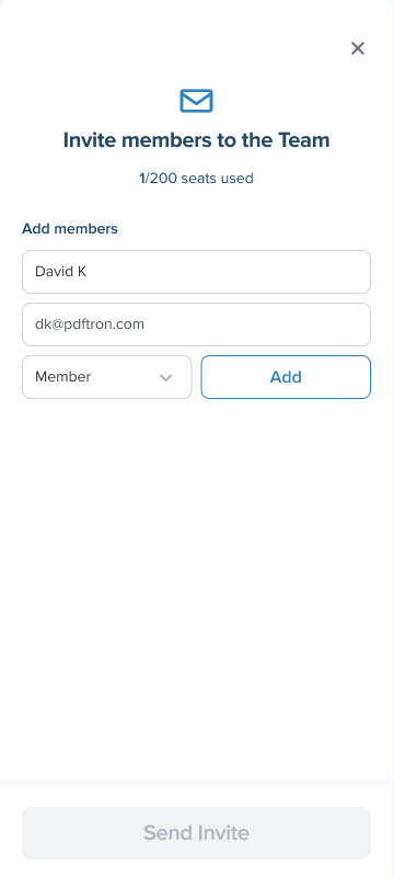
Automatic member Invitation
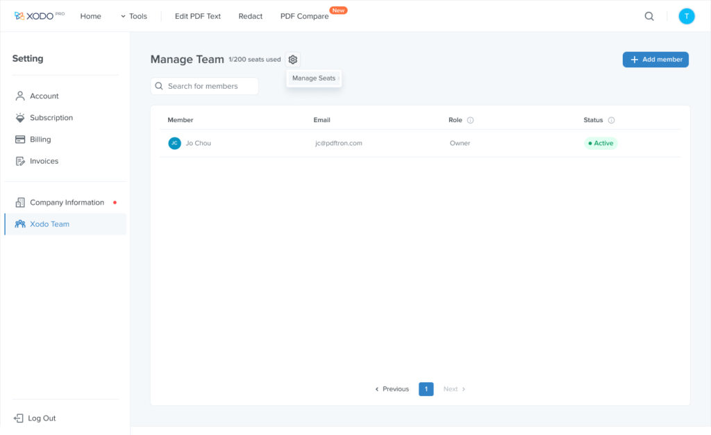
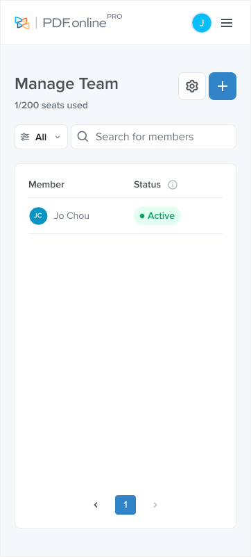
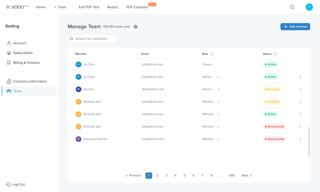
The challenge was to design a seamless way for members to be invited to teams, considering whether users needed to sign up or log in via email first, how the system would detect emails, and how to manage guest invitations. I collaborated with the development team to address these questions, and together we uncovered additional complexities and ensured the UI aligned with technical capabilities. To streamline the process, I designed an auto-fill function that searched for registered accounts and reduced manual input errors, additionally sent an email prompting users to register if no match was found. This solution enhanced the invitation flow, improved user onboarding, and increased team adoption rates by simplifying the process for both registered and guest members.
Upgrade member licenses
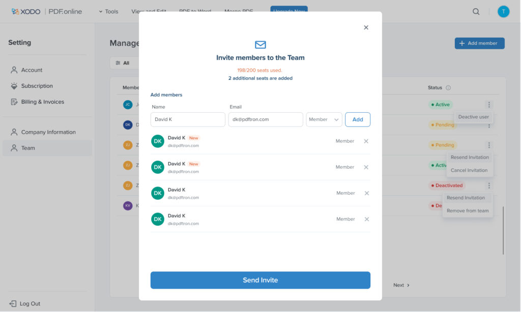
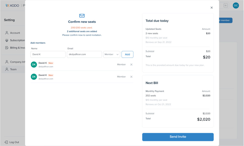
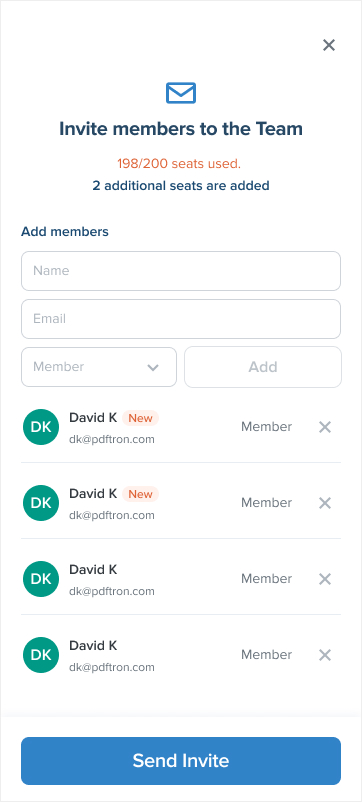
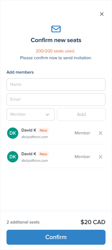
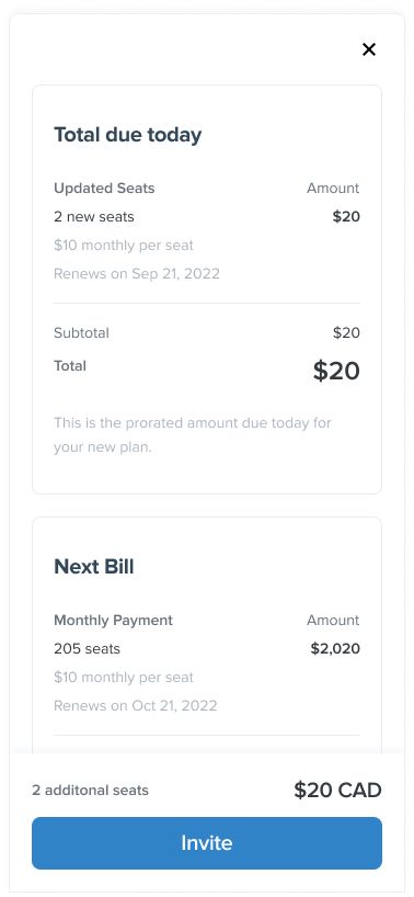
The challenge was to notify users when they were nearing their license limit and needed to upgrade to add more members. Instead of restricting users from adding members, I designed a solution that allowed them to continue adding members with a label indicating they had exceeded their limit. On the next page, users would see the updated payment details reflecting the additional cost, making the process clear and seamless. Alternatively, users could also adjust and upgrade their plan on the subscription page if error was made. This approach minimized user action, prevented confusion from getting lost between pages, streamlined the upgrade process, and ensured a smooth experience without disrupting workflow.
Plan and seats (licenses) adjustment
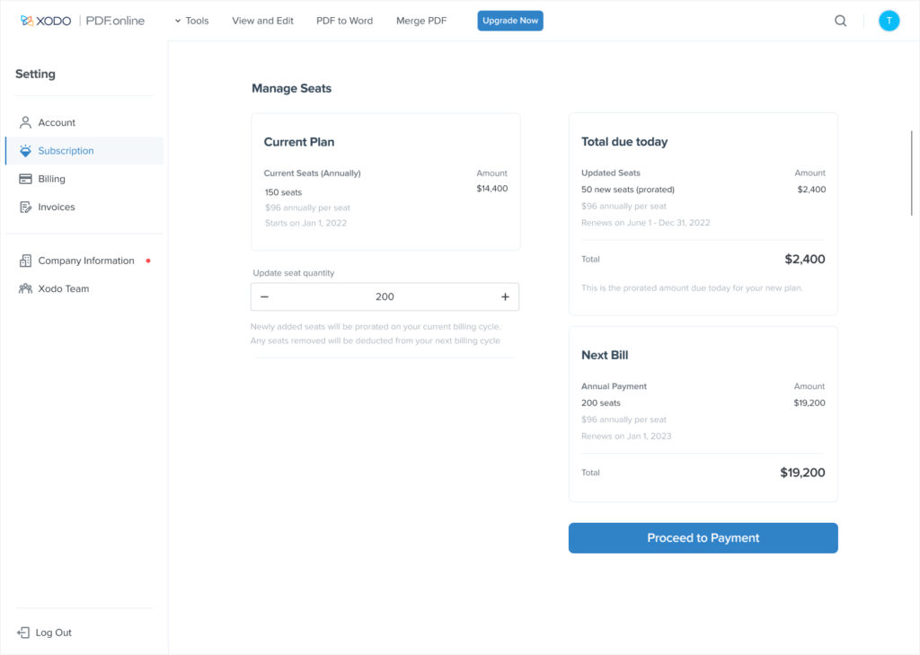
When designing the license upgrade, downgrade, or cancellation process, the key goal was to prevent frustration and ensure seamless payments for members. I created a subscription page that allowed users to easily adjust their team seats while accounting for different scenarios to minimize errors. Collaborating with the PM and developers, we carefully considered how changes would impact monthly or yearly payments.
We covered various scenarios in the UI:
Users could increase seats and view the price difference between their current plan and the next bill.
Users could decrease seats and see the corresponding price adjustment.
Before downgrading seats, users would need to deactivate accounts.
Active seats in use couldn’t be reduced.
The result was a clear and informative UI, showing price changes between current and upgraded licenses. We also added a notification banner to remind users they needed to deactivate accounts before reducing seats, avoiding confusion. To prevent payment errors, we disabled the “Proceed to Payment” button when necessary. This design ensured a smooth, seamless process and significantly reduced potential mistakes during subscription adjustments.


Tool landing page
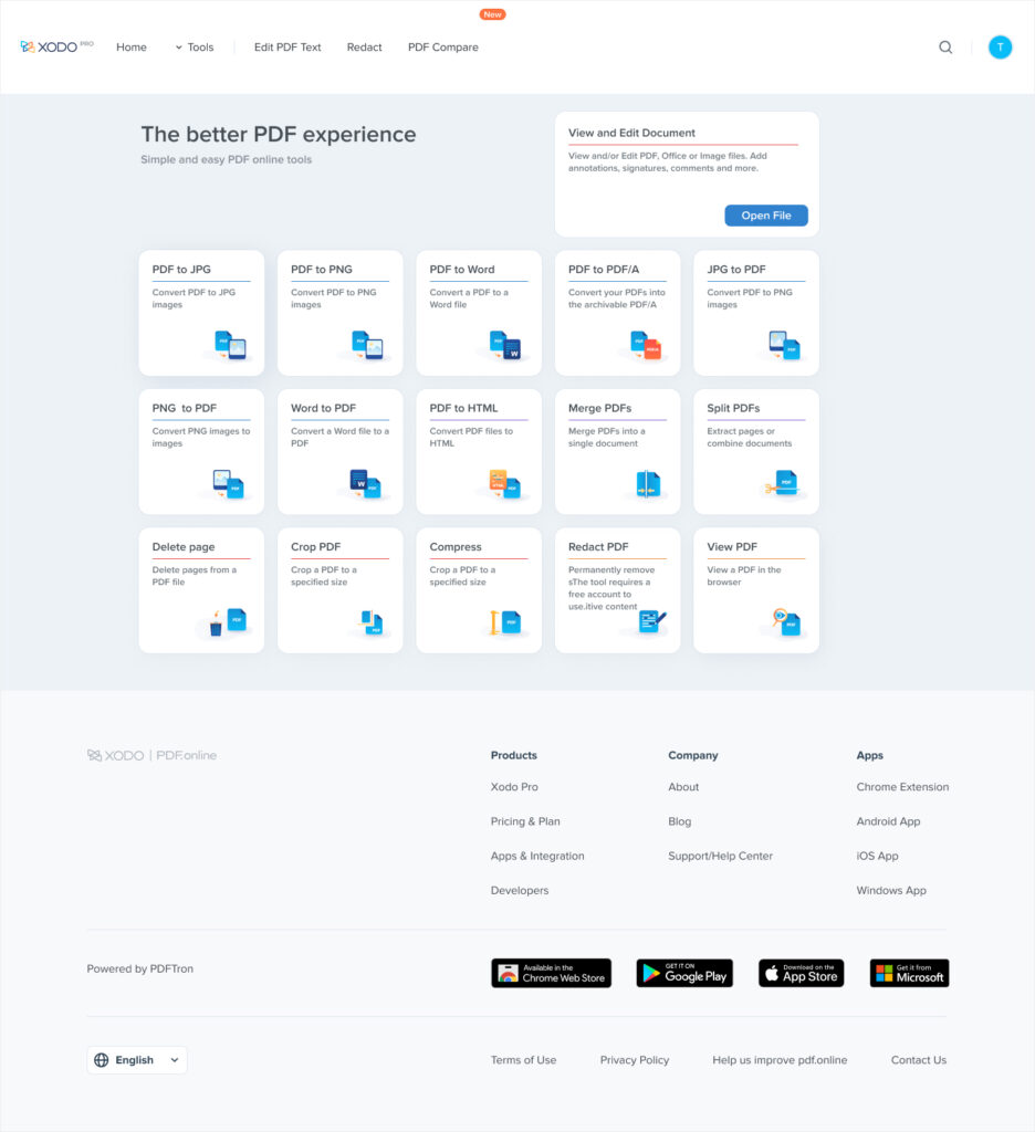
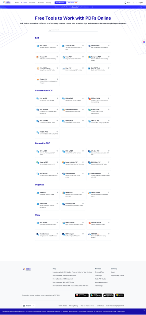
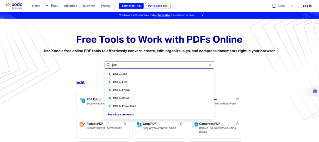
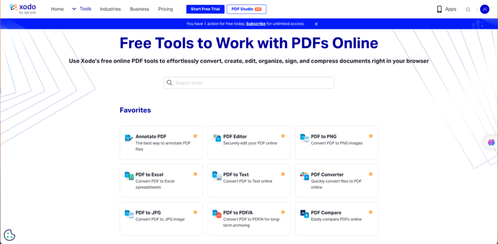
The goal was to improve the search functionality and enable login users to add tools to their favorites, addressing the disorganization of the old tool page. Previously, the page was cluttered, with actions focused on opening files without clearly indicating which tools were linked to those files. To resolve this, I restructured the page by grouping tools into larger categories and redesigned the layout from 5 to 3 columns, creating a more spacious and readable interface. This made the page more engaging and intuitive, allowing users to easily interact with the search function, find specific tools, and add them to their favorites. The streamlined layout improved usability and highlighted the search feature for more efficient interactions.
Challenges and Reflections
Gathering feedback from various stakeholders including design, development, marketing and product management was challenging. Some design features were difficult to understand, and the UI could have been more intuitive. The copy also required changes, and the goal needed to be clearer for different user flows. To prioritize our work, we followed the scope, and the PM took notes on the pros and cons of the feedback. We evaluated whether the feedback was necessary to improve the missing components, validate the time, risks, and value, and help us define undiscoverable answers while reducing unnecessary interactions and saving time.
