5U Website
Overview

Problem
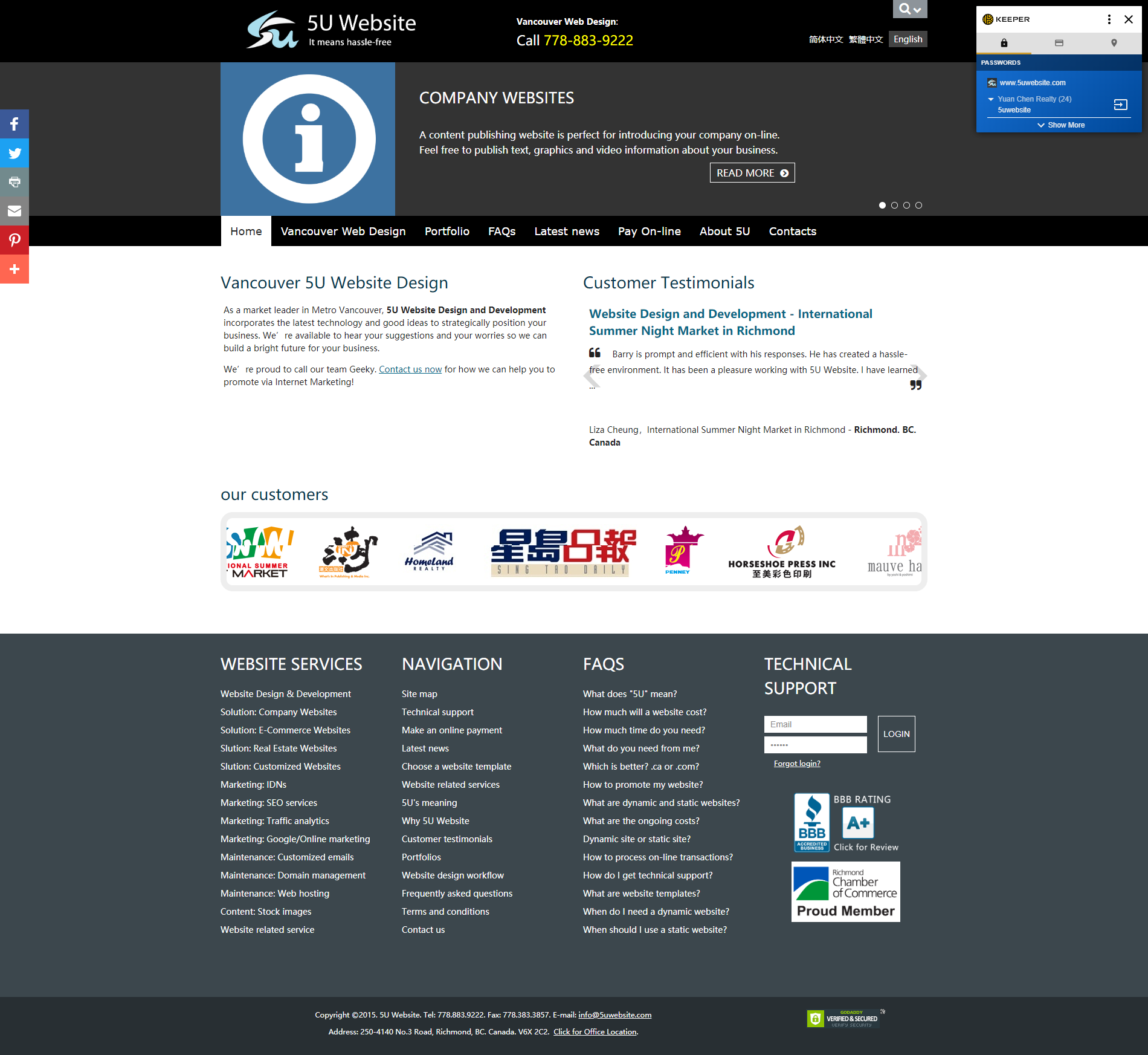
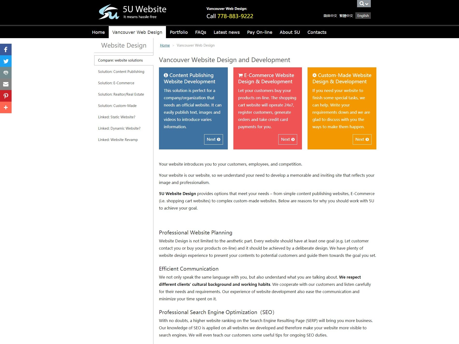
The old version of 5U website was built with unorganized layout where it contained many sub-filters and categories inside pages that misled people to understand the service features and company goals. Too many long paragraphs without illustrations made the content hard to read. The problems increased our budget in communicating with clients and reduce clients’ engagement to discover the highlights.
Goals
The project aims to create high-quality marketing websites with tailored service features for various industries to boost business visibility and client engagement. The user goal focuses on offering a multilingual (3 languages) experience, enhancing CTAs like free quotes and form submissions, and demonstrating the company’s expertise in building top-rated websites. The project involves designing responsive sites for desktop and mobile, using graphic illustrations to capture attention, and refining Information Architecture (IA) to improve usability and increase user engagement.
Homepage Design
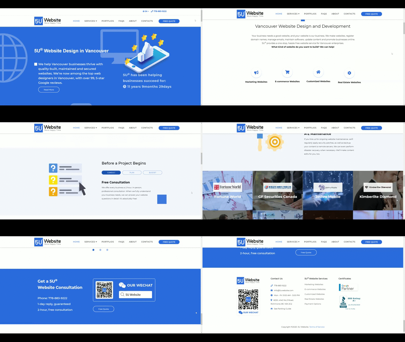
The requirement was to showcase the message of “5-stars review” letting audiences to quickly understand what the website niche was and how cool we could do for other business. A small animation and beautiful graphics were added to improve the feeling and vision to introduce who we are and the count-down clock showed the company’s experience and profession to build people’s trust.
Business Process Tabs
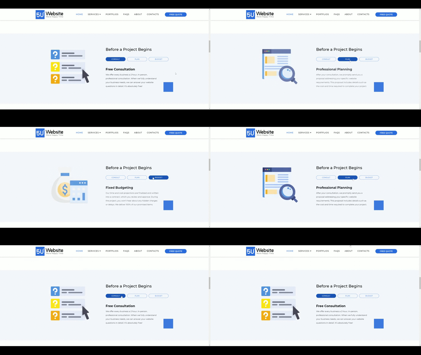
We didn’t want our audiences to scroll a lot, but when they scrolled, we wanted them to see interesting interaction. Speaking of minimal style, we hided the small content and “CTA” in a hover effects/buttons to keep the interface clean and simple to understand.
Service Features
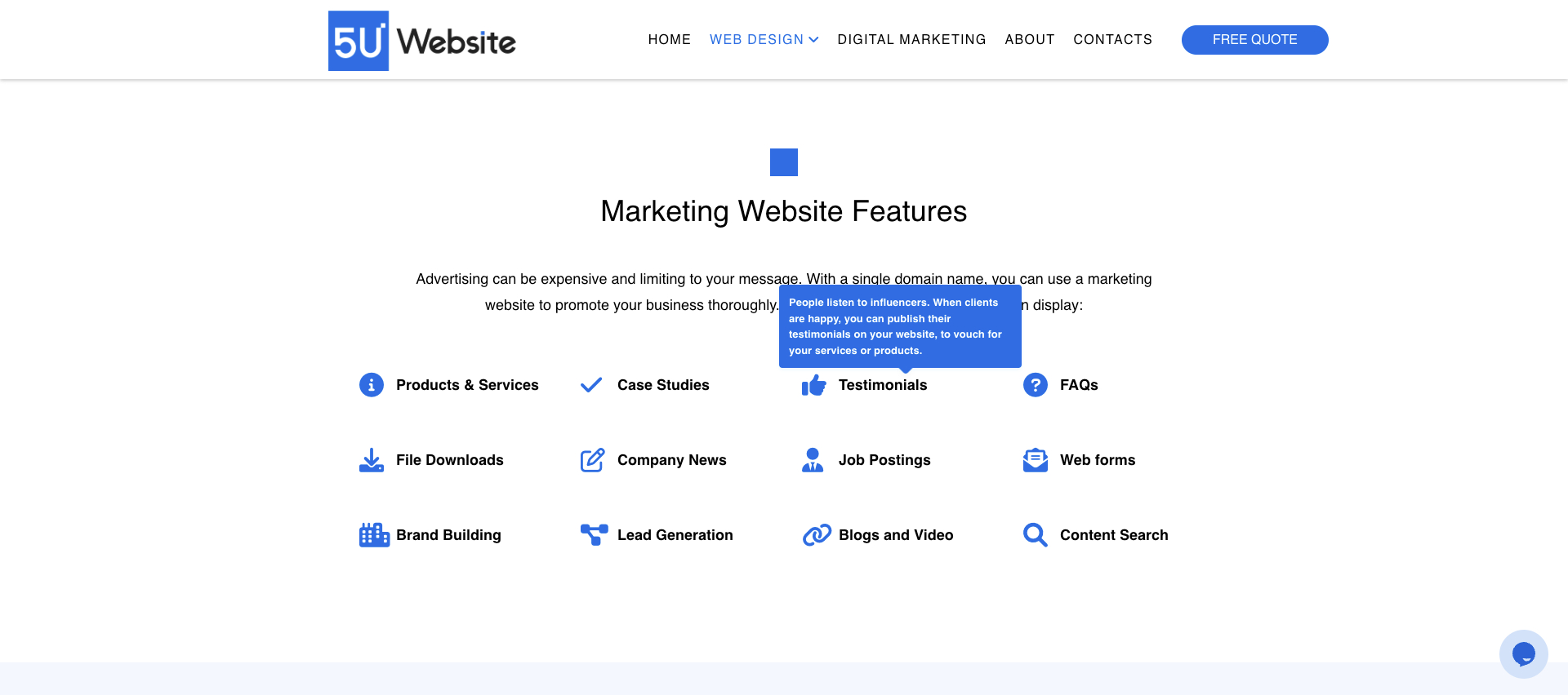
In each service page, such as “Marketing Website Design”, there were 12 features to be the highlights and each feature needed to showcase its long description in detail. Therefore, I decided to put 4-icon features in a row and had a tooltip interaction when the feature is hovered.
Project Case Study
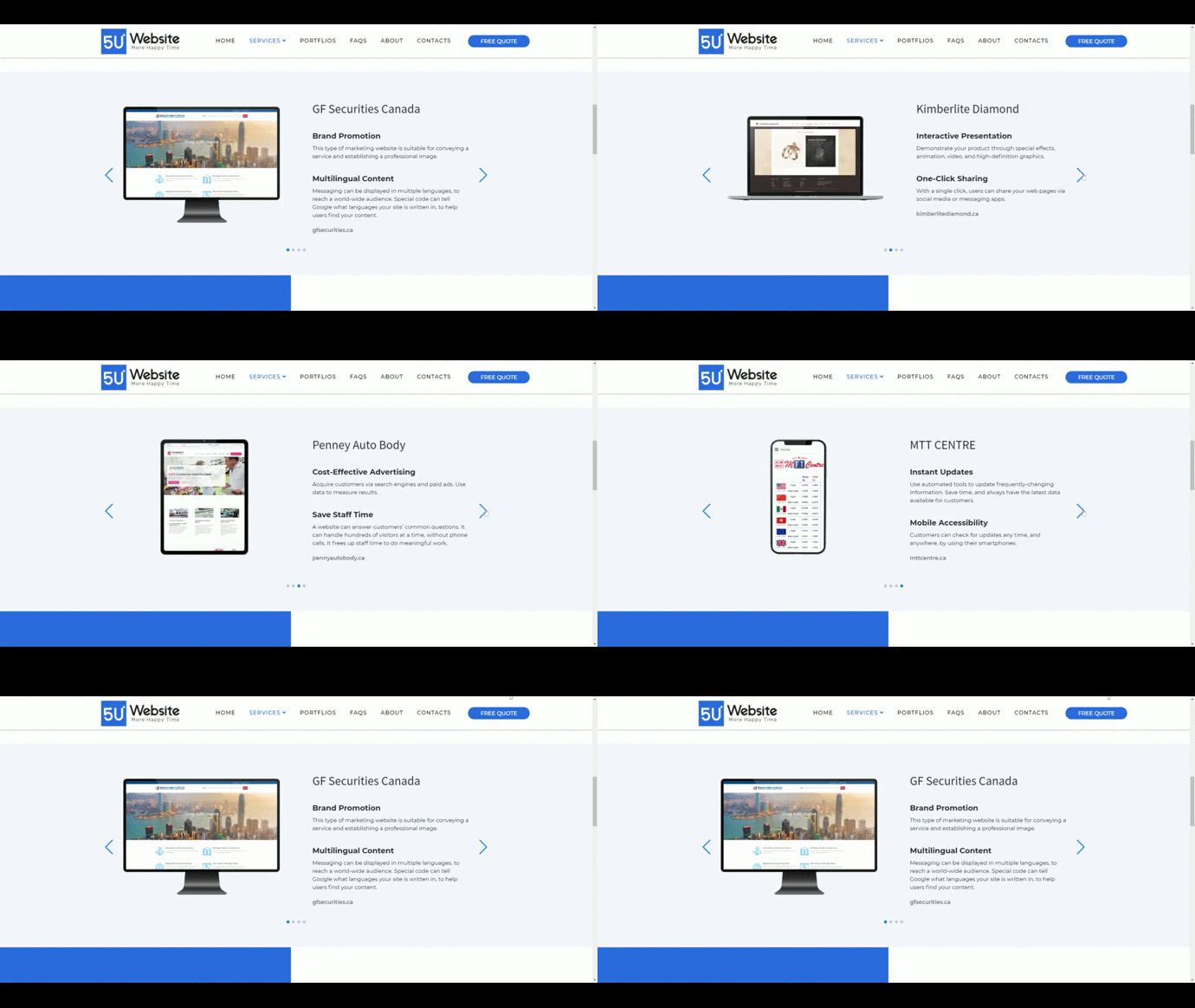
The requirement was to showcase the four portfolio highlights of the marketing service as well as to demonstrate the framework in different devices. I decided to use a slider to perform the main cases which could also reduce the height of the section to avoid too much scrolling. The business goal was to show the different devices we could do and redirect users to the real site we built for the clients.
Portfolio Listings
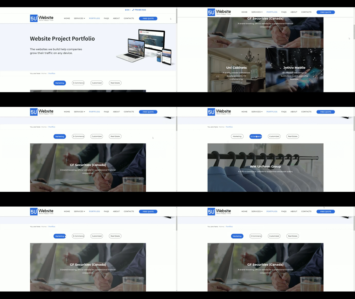
The requirement was to showcase all service highlights on a single page, featuring over 100 portfolio works. To organize this, I implemented a tabbed navigation system, categorizing portfolios by service type. When a tab is selected, the corresponding filtered portfolios appear below, displayed as a gallery for a quick overview. This approach not only streamlined the user experience by allowing easy access to specific works but also maintained a minimalist design, helping users quickly find their desired projects.
Portfolio Details
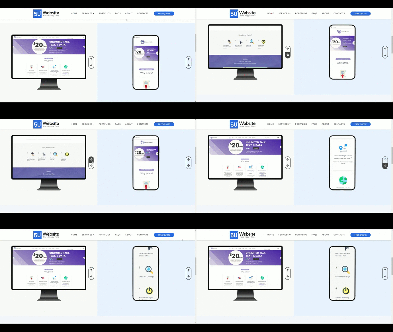
The main goal of this page was to showcase the website’s look on different devices, featuring both desktop and mobile versions. Users could scroll up and down using arrow buttons to experience the design and style. Initially, we planned a more advanced interaction where users could flip through pages, but due to budget, time constraints, and framework limitations, we opted for a simpler scrolling interaction. This approach effectively met our expectations while staying within project constraints.
Front-end development
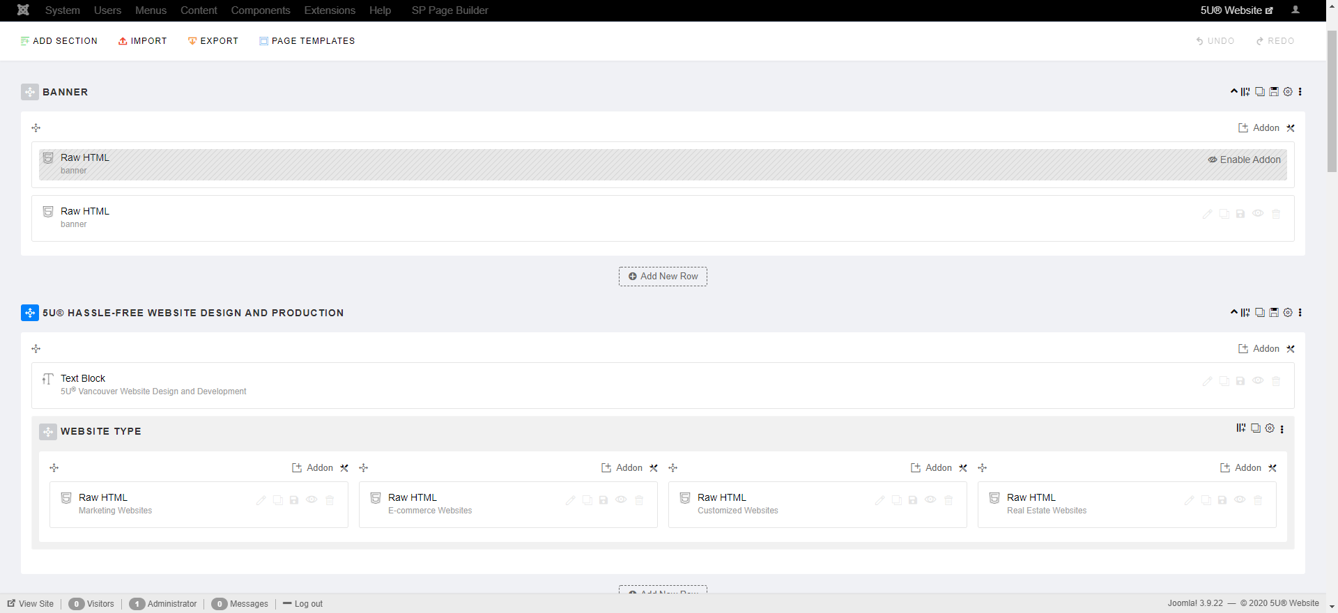
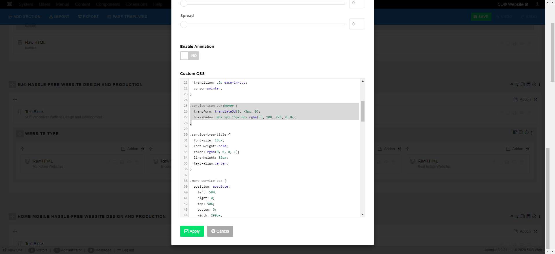
We used Joomla (a CMS tool) to structure the website, giving me experience in both front-end and back-end development. This involved configuring backend content as frontend features and applying CSS for visual effects, enhancing my problem-solving skills. Designing custom website blocks from concept to implementation was challenging but rewarding. For advanced developments, I collaborated closely with developers, providing redesigned mockups for significant changes. We used Lanhu (similar to Zeplin) for clear design communication, ensuring precise coding details aligned with our vision.
Challenge
We aimed to make our website stand out with powerful features. New design elements were often added after initial builds, requiring careful adjustments to ensure a seamless fit on both desktop and mobile layouts. With three language versions, every change increased our workload threefold. Effective communication with remote developers was crucial, requiring detailed explanations to prevent misunderstandings. Although we faced delays, budget adjustments due to bugs, and increased pressure from sudden changes, strong teamwork helped us resolve conflicts and deliver quality results on time.
Reflection
It was my first time redesigning a customized marketing website. From zero to the end, I spent about a year to finish the website with many challenges and conflicts. I learned a way to improve better UX designs and the technical measurement for high-fi mockups. I understood how to deal with problem-solving skills in most of the urgent cases by giving a clear thesis and examples. Overall, building a website is not just about the UX/UI design, but also the marketing strategy to consider what a successful website is. I believe the new 5U website will improve many clients’ problems and gain excitement while exploring the website.
