Canada Post
Project
Onboarding
Industry
Postal Service
Team Size
25+ Employees
Timeline
6 months+
Tools
Figma, Miro, Jira
Project
Onboarding, Consumer Home, Track
Industry
Postal Service
Team Size
25+ Employees
Timeline
6 months+
Tools
Figma, Miro, Jira
Overview
The Canada Post app offers customers a swift and convenient method to register for features, enabling them to receive alerts and updates regarding upcoming deliveries, track packages, and receive timely notifications throughout the delivery process.
My primary responsibility was to propose a new onboarding design in response to low registration rates identified through a UX audit. I collaborated with another designer to rebuild the onboarding flow, creating experiences for both new and returning users while integrating the new flow seamlessly into the existing system. I also identified inconsistent UI patterns and led the effort to manage and standardize the design system, replacing the outdated system with a centralized mobile design library, including guidelines and design tokens for both Android and iOS. The goal of the project was to increase user engagement, improve usability, and ensure design consistency across platforms.
Problem & Goal
Canada Post regularly updates features to highlight key messaging around sending and delivery functions, with the goal of enhancing value, reducing user frustration, and increasing user engagement and registration rates. I collaborated with the team to redesign the onboarding flow, banners, and layouts for key services like Track, MyMail, FlexDelivery, and Quick Drop. We also identified inconsistencies and integrated additional components into the design system. Ultimately, our aim was to conduct a design audit to uncover essential issues and create seamless, holistic user flows that ensure smooth, convenient interactions and consistent UI while supporting business objectives.
App Banner
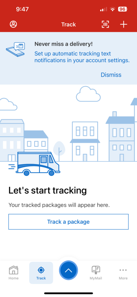
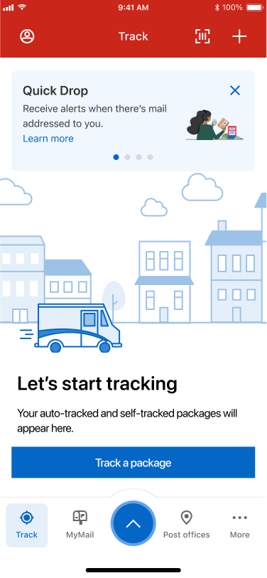
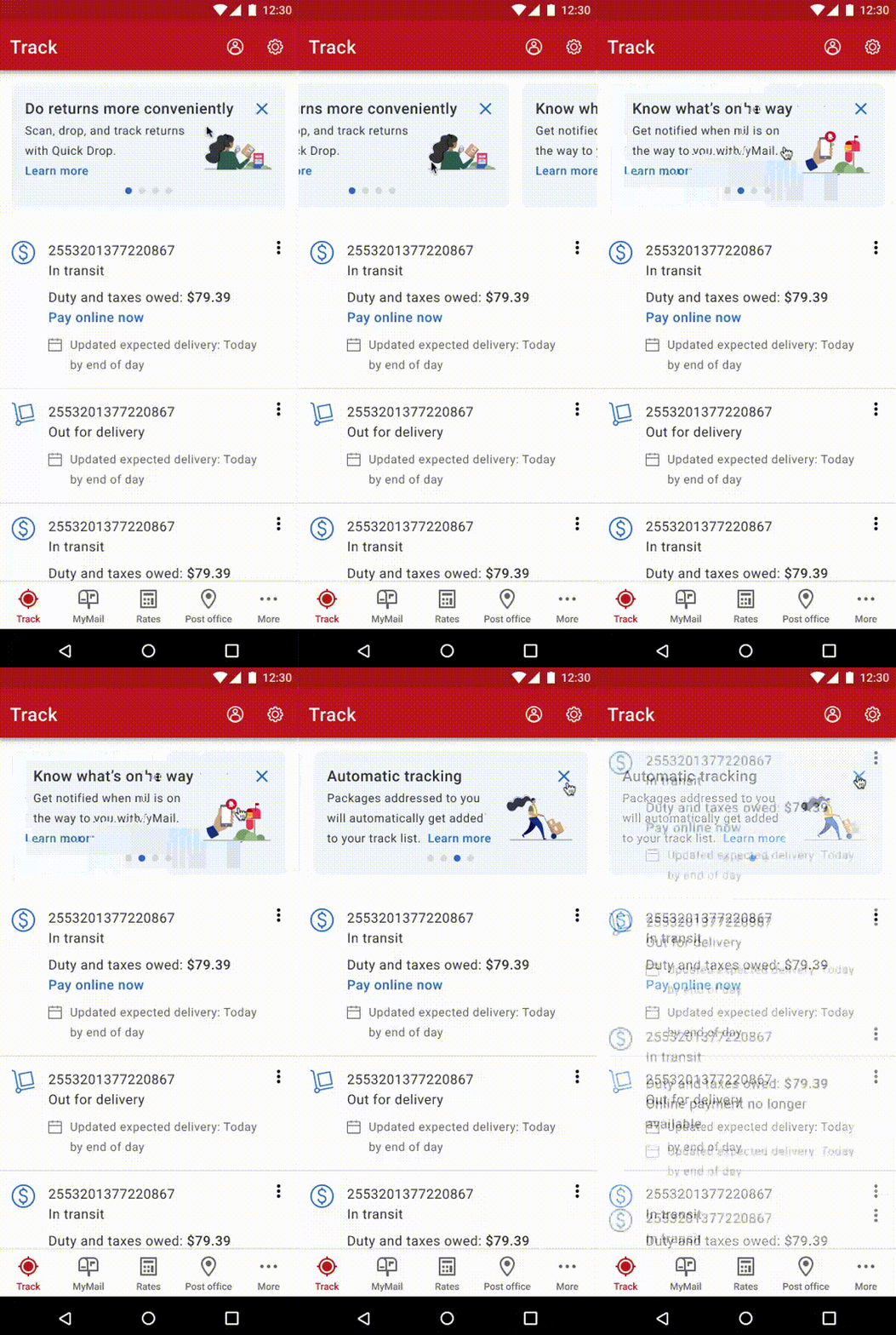
The design challenge involved delivering important feature notifications to users through text messages. The existing design was limited by a single content display, making it difficult to communicate multiple messages effectively. Our goal was to introduce these new features in a visually engaging way to encourage users to sign up. To address this, I redesigned the banner by integrating a slider component, which allowed users to scroll through multiple messages. I also incorporated illustrations to make the design more visually appealing and engaging. Additionally, I minimized the “dismiss” button to a smaller “x,” freeing up space for more content. The result was a visually attractive, user-friendly banner that increased the interaction rate and ensured that our key features were more likely to be seen, ultimately boosting registration rates.

Feature Update
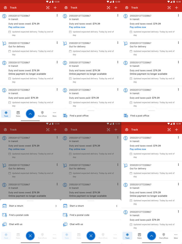
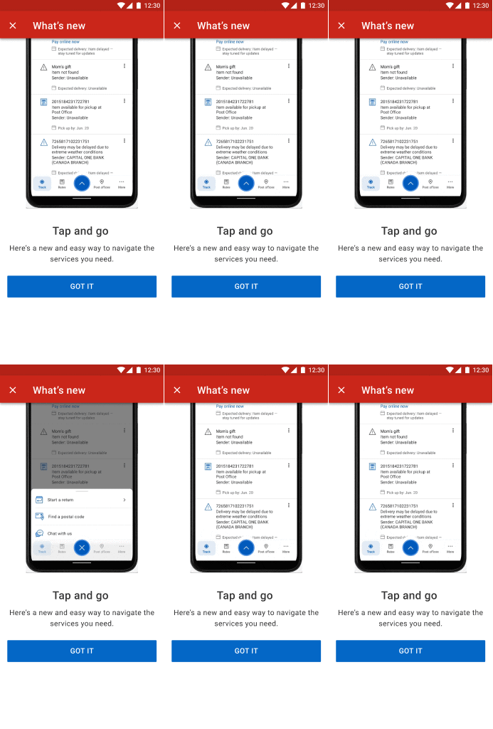
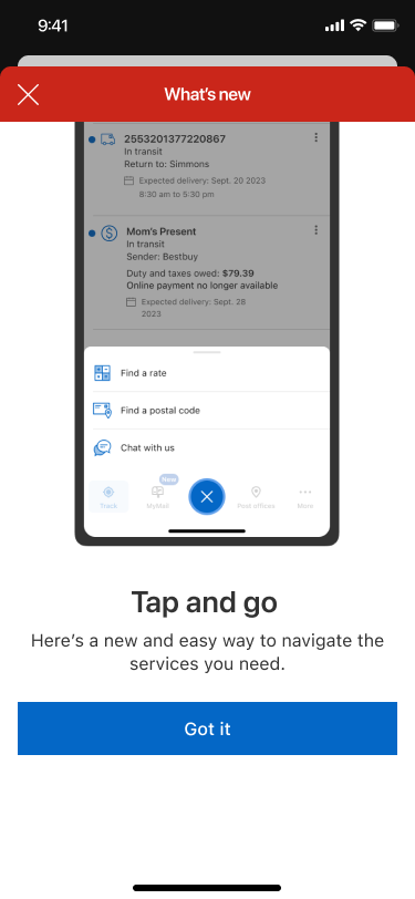
Canada Post frequently updates its features on both IOS and Android systems, but I noticed the current design lacked a pop-up notification system to inform users of new features or updates, which could lead to losing opportunities to convey the value and benefits of these messages. To address this, I proposed adding a full-screen pop-up with motion effects, using short, highlighted keywords to capture users’ attention. To achieve this, I created a navigation prototype and collaborated with developers to implement it across different systems, transforming the effect into a GIF for better visual communication. This design would introduce users to new features and encourage interaction, improving their exploration experience. The dynamic visuals aimed to enhance user understanding of updates and boost interaction. The design was approved for permanent use and integrated into the design system for future updates.
Onboarding
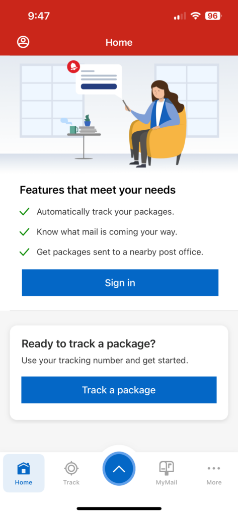
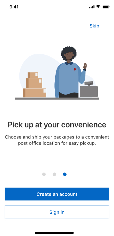
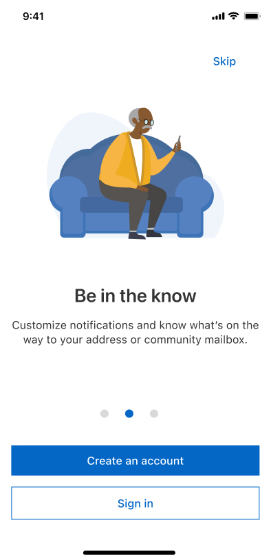
To improve the registration rate, the product and marketing teams recognized that the current onboarding process wasn’t effectively highlighting key features and values to users. We proposed redesigning the onboarding flow for new users, as the existing version consisted of basic notification screens that were visually unappealing, inconsistently popping up and easy to skip. I suggested introducing three key feature slides on the initial screens, incorporating engaging graphics, and collaborating with the UX content writer to craft a compelling hook that showcased the benefits of signing up. This redesign provided users with a clearer understanding of what Canada Post offers from the start, encouraging exploration and improving registration rates.
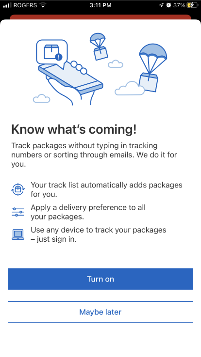
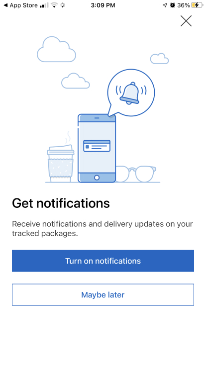
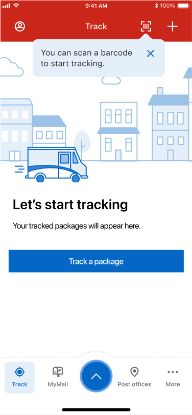
I consolidated the existing onboarding message into one single screen slider, making the content easier to understand while aligning with business goals. This approach provided users with more options to explore, rather than simply pushing them to register, creating a more user-friendly experience.

Repetitive UI elements
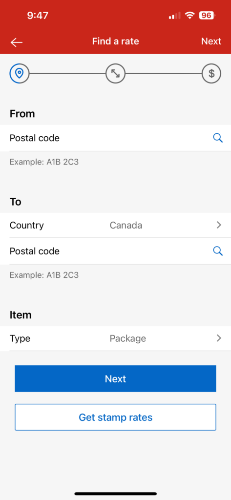
After completing the new onboarding screen, we noticed that some outdated and newly created UI elements were repetitive and appeared randomly, being replaced without proper sequencing and order. This issue could potentially lead to conflicts in onboarding user flows and cause confusion and frustration among users encountering similar content. Our objective was to restructure and consolidate these features into a user-friendly and streamlined flow, minimizing the number of steps for new users installing the app. This approach would enable users to easily access our beneficial features and increase the amount of users signing up for an account.

Upon reviewing the current flow, we discovered numerous screens, some of which were deemed unnecessary or improperly sequenced. To seamlessly integrate the new screens into the existing flow, we needed to outline potential scenarios for various users to navigate the flow and achieve the business goals:
New users who have just completed the initial installation, they should be able to view the highlighted features of the app. However, some users may prefer to explore the app before registering.
New users may wish to learn about the benefits and functionalities associated with a registered account.
New onboarding flow
We integrated essential modules into a cohesive onboarding flow, ensuring seamless transitions between each step.
Instead of the notification screen, users now encounter initial installation onboardings before reaching the homepage. This approach ensures that users familiarize the app’s features before deciding to create an account.
To enhance user experience, the notification module now appears when a tracking item is added to the list. This enables users to begin tracking items with notifications enabled on their devices.
Upon signing into users’ accounts, any new updated screens will only appear this time to prevent conflicts with other screens.
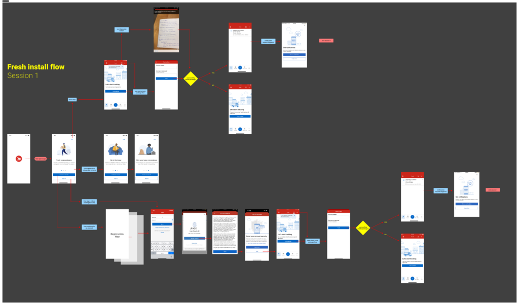
The user journey begins with the initial installation screens, which provide information about the highlighted features of our app. Following this, an updated screen pops up to notify users that a menu has been updated. Subsequently, a banner appears at the top reintroducing the same features, and finally, another popup message appears.
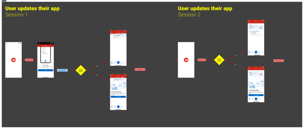
Questions: When do users see the updated screen and banners?
Solution: The updated screen is specifically designed for users who are returning or already familiar with the app. Upon reopening the app, these users will see the updated feature and have the chance to explore it on their own. Conversely, for new users opening the app for the second time, the updated screen will be prioritized, while the installation onboarding screen will remain inactive until their next installation.
Final Result

The new flow provided us with a great deal of inspiration to identify numerous UX and mobile service issues upon its completion. These included inaccurate delivery updates, inconsistent UI components, and login errors. As a result, the team has decided to conduct further research and a UX audit to evaluate the impact of these issues and prioritize improvements. These improvements may involve enhancing delivery tracking accuracy, standardizing UI elements for consistency, optimizing the registration process to minimize login errors, and providing clear instructions for managing incorrect or returned packages. We will closely monitor key metrics such as user sign-up rates, engagement levels, and satisfaction to assess the effectiveness of the implemented optimizations and enhancements.
Design System
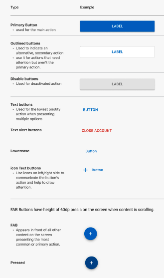
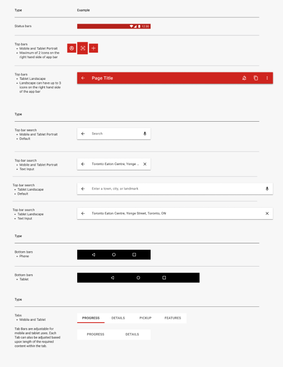
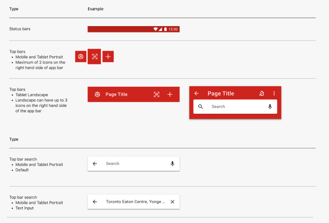
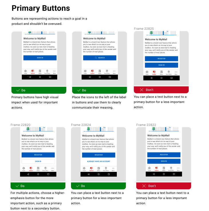
I Identified inconsistent UI patterns through a design audit and collected 200+ components from 10+ designers across 50+ files, documenting them in Jira for team-wide alignment and future scalability. I led weekly team presentations to update and align our design guidelines, collaborating with the team to define standards for color, typography, sizing, layout, navigation, menu and graphic usage—including clear do’s and don’ts. I ensured consistency across both iOS and Android by standardizing components using variants and states, and by providing a token system to support seamless developer implementation. Although adapting to the new system required time and collaboration, proposing and driving this initiative strengthened team alignment and set a solid foundation for scalable, future development.
Challenges and Reflections
Collecting feedback from various stakeholders, including designers, developers, marketing team, and product management, was a difficult challenge. Even minor tasks often required approval from multiple departments before reaching final implementation. Changes were requested countless times based on team feedback, leading to repetitive work and delays in other tasks. It was difficult to navigate through the diverse suggestions from different leaders and determine the most appropriate solution. While typically entrusted with decision-making, my decisions often prompted further feedback, leaving me hesitant and uncertain about the best course of action. I learned that as long as my research direction was sound and I provided sufficient explanations for my design proposals, I could confidently make the right decisions. Maintaining a firm stance and strong determination in communication allowed for more decisive outcomes without procrastination. Importantly, it was crucial to communicate the challenges faced with the team and seek their assistance in overcoming them together. As a result, we assessed whether the feedback was essential for improving missing components, considering factors such as time, risks, and value. This approach helped us identify previously unnoticed solutions while minimizing unnecessary interactions and saving time.
