My GoodReal
Overview
My GoodReal (MGR) is an analytic website platform that provides solutions to real estate agents to connect with customers about buying or selling the residential / commercial listings. The website collects all listings’ data and generates a statistic in the dashboard to monitor all histories of viewed, browed, saved, offered and purchased results. This changes the way of how realtor agents manage clients’ information and send out as much of notifications to help clients find the best properties.
Problem
Management system has always been a problem for realtors to contact with multiple clients regarding buy/sell at one time. Especially, a realtor’s duty is to get the recent updated listings, negotiate a good price, make offers, run the open house and understand requirements for customers. It’s hard to provide all detailed information to different clients by sending email or making phone calls. This brings the impact to lower work efficiency and reduce client size.
Goals
The goal is to support realtors in managing their daily tasks and boosting business through customizable websites, encouraging subscription post-free trial. The platform aims to offer user-friendly templates that realtors can easily customize, enabling clients to explore listings, get notifications, and make offers. The project includes developing at least 10 template styles, a Pagebuilder tool for customizable display, advanced search features, multi-language support, desktop and mobile versions, and a client-facing dashboard for booking appointments. The backend control for realtors is out of scope.
Understand Our Audiences
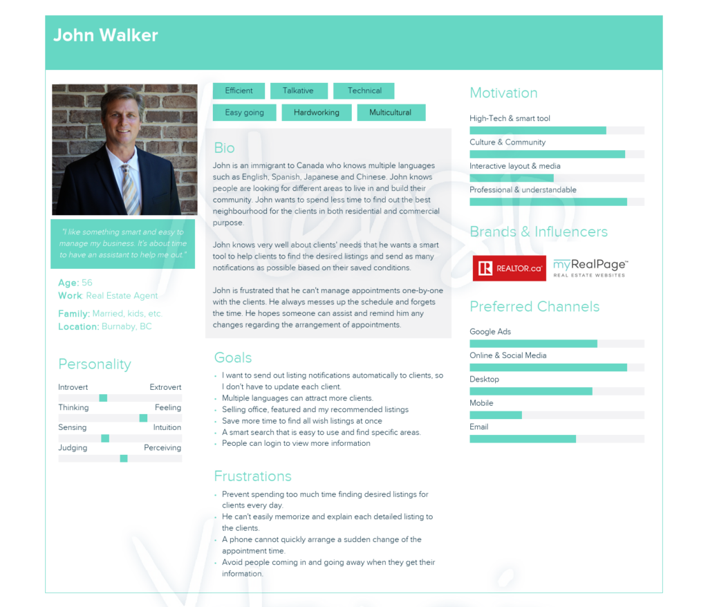
We conducted interviews with over 10 realtors aged 35-55 to gather insights into their needs. The interviews revealed that many have not used realtor platforms but are open to learning. They prefer customizable website layouts, simple property listings, and easy-to-use search filters. Key desires include features to track contract timelines and view history, as well as appointment booking for property viewings. These insights helped us identify common frustrations and user needs, focusing on creating a platform tailored for experienced realtors running their own businesses.
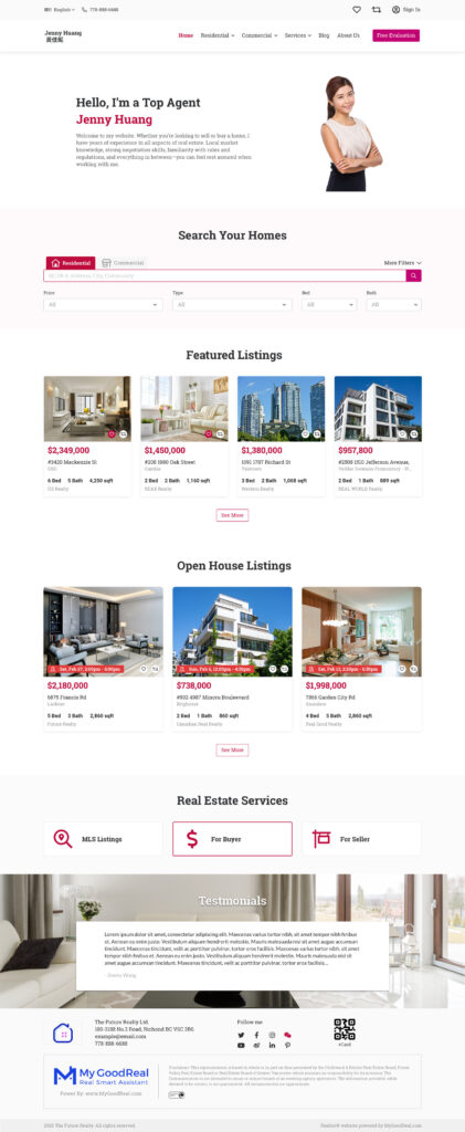
Web Design Template Layout

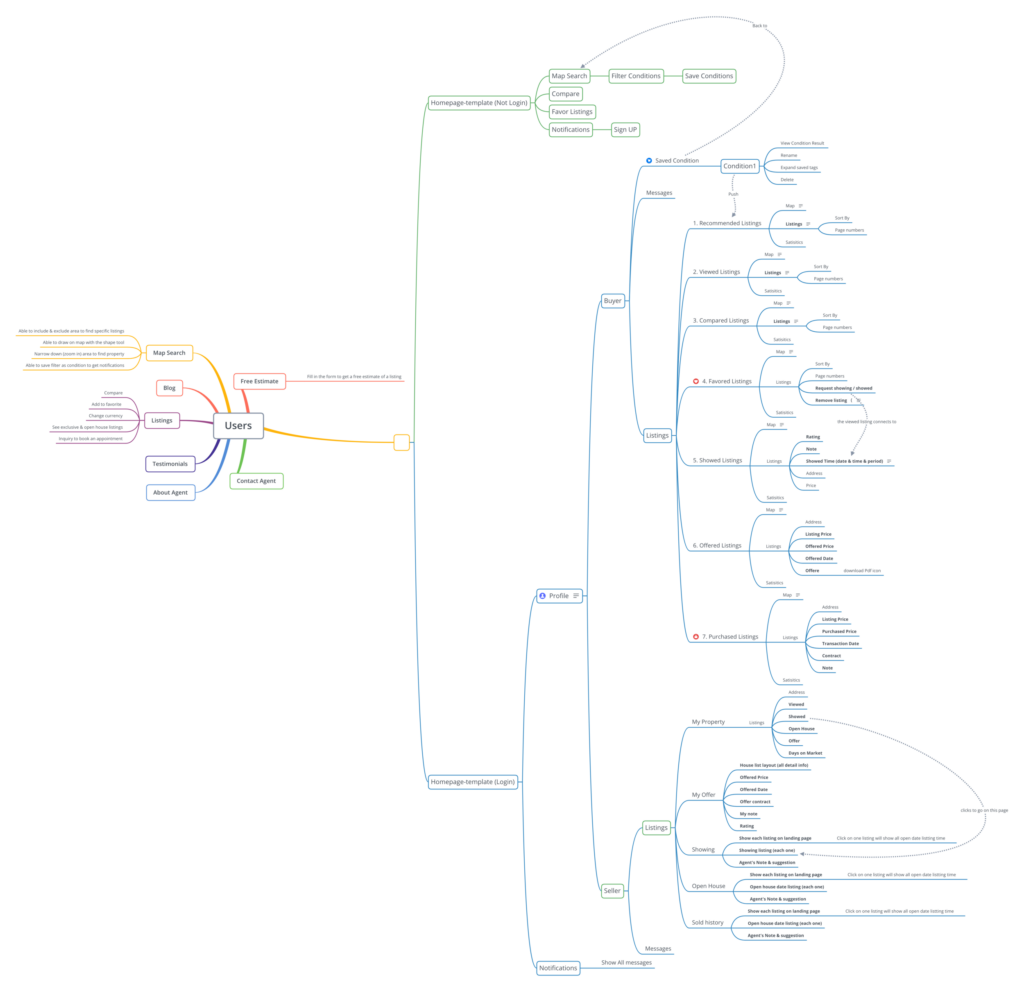
Frontend sitemap
The user flow describes the sitemap and how the platform structures with features we want to implement for realtors. Mostly we focus on users before and after login, so they can see different results to decide whether or not to continually using MGR. We discriminate the 2 main sections on the website: the frontend listing, map search and user dashboard. We want realtors to filter conditions to find desired listings and save them to get notifications in their login profile. This short sentence represents different perspectives of the user journey and lists out many features we need to create. As well as to consider the relationship to connect with backend development is a big challenge for us.
Smart Search Filter
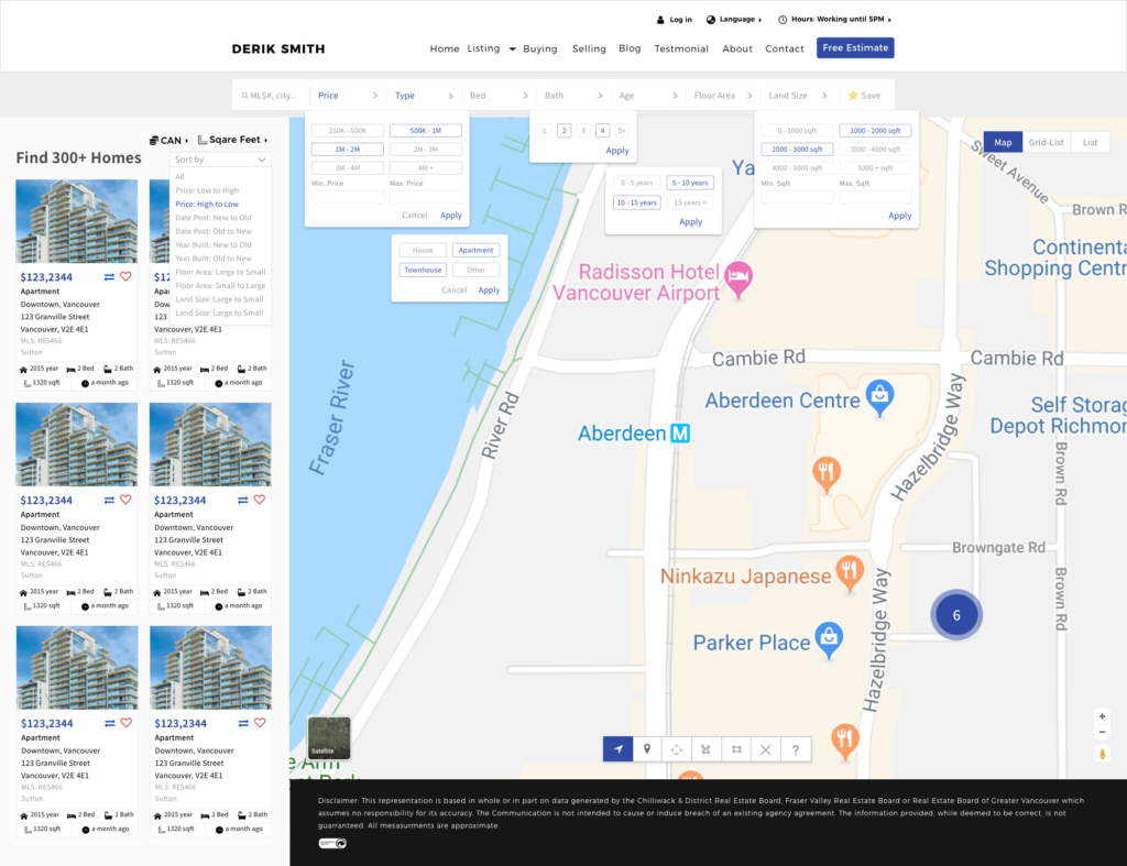
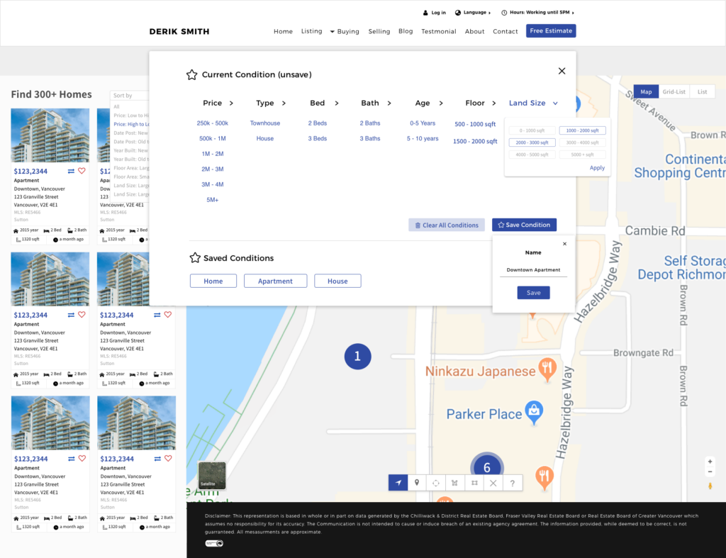
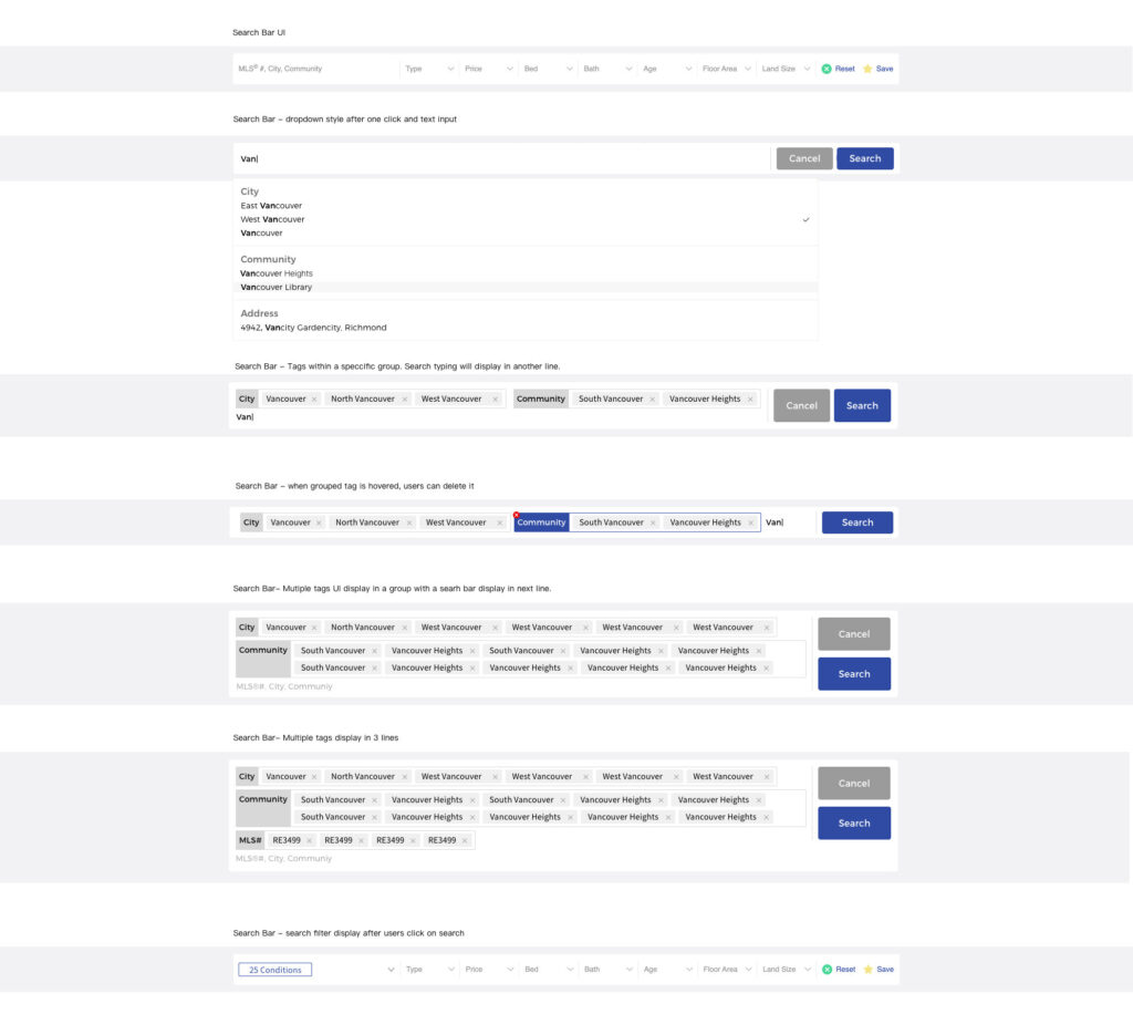
Considering to make an advanced search bar, we implanted a keyword search that each keyword would display as a tag and automatically organize in a group of City, Community, Property type etc. I created an interactive guide on what users should do if they made certain actions.
Save Searched Conditions
Our first iteration of a save tool allowed user to save the filter conditions and edit them infinitely until they’re satisfied. However, considering each saved action required a technical skill to remember each condition and run the browser every time. We only allowed users to rename, delete and view the condition to avoid too much workload for the developers. If users wanted to edit any conditions, they could simply reset and add new.
Search Bar Status
Our first iteration of a save tool allowed user to save the filter conditions and edit them infinitely until they’re satisfied. However, considering each saved action required a technical skill to remember each condition and run the browser every time. We only allowed users to rename, delete and view the condition to avoid too much workload for the developers. If users wanted to edit any conditions, they could simply reset and add new. Based on the requirement, my project manager and I decided to make 7 main filters to search and save the conditions. Each filter was designed with a dropdown list to show different conditions. Considering that users will have as many conditions as possible, all conditions are made as buttons that allow multiple selection before users go for search. I made the dropdown list always stays on the screen when the users make a onetime click to ensure the dropdown will not disappear while users are interacting with the multiply selection.
Property Listing Detail Data Page & Appointment
The VOW MLS® data provided by the Real Estate Board includes detailed listing information like kitchen count and room sizes, but this can only be accessed in a password-protected area. We considered user preferences for contacting agents directly from the listing page. To streamline this, we placed the agent’s inquiry information on the right side, allowing users to easily request viewings with one click. The setup aimed to simplify the booking process and enable adding appointments to the calendar as reminders.
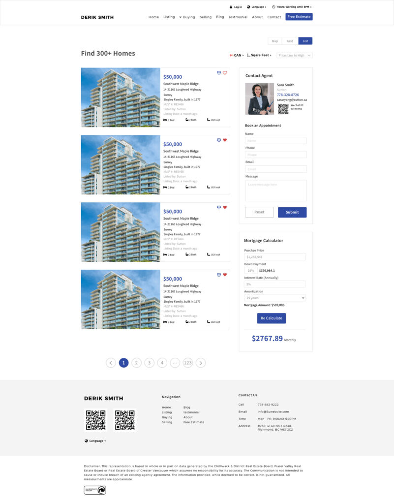
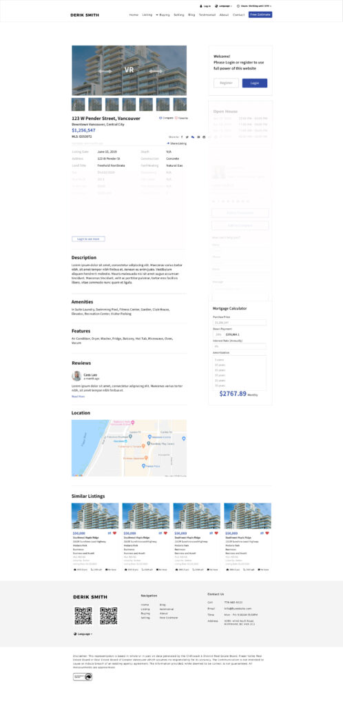
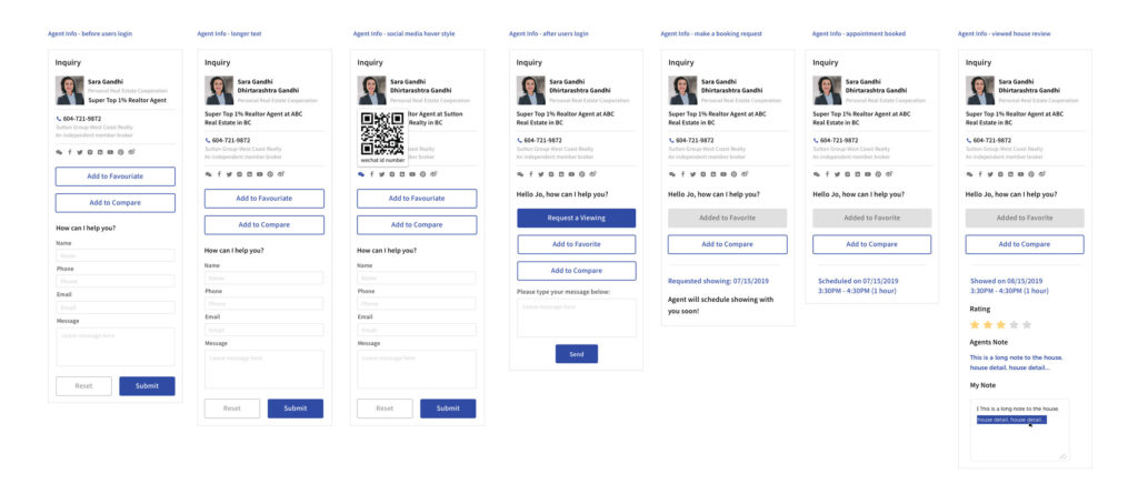
We wanted to let users to view all the listing details and contact the agent. We received all the realtor’s information and data value to display on the page. All data needed to consider its length and width in all languages to fit in the window size. We took the most important values, put them in 2 columns layout and rename the longest width value to calculate the precise measurement for the development team. This information proves realtor’s profession which makes users’ motivation to make a request. The interactions include the inquired status when users click on the request button such as a message box, schedule time, rating and agent’s note after a property has been viewed.
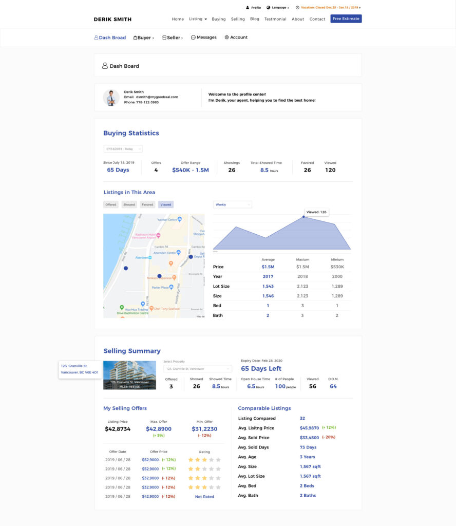
User's Dashboard
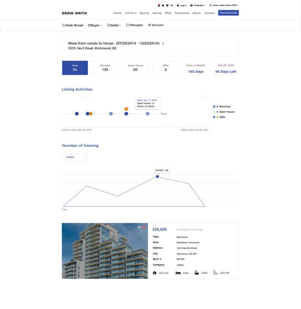
We wanted to let users to view all the listing details and contact the agent. We received all the realtor’s information and data value to display on the page. All data needed to consider its length and width in all languages to fit in the window size. We took the most important values, put them in 2 columns layout and rename the longest width value to calculate the precise measurement for the development team. This information proves realtor’s profession which makes users’ motivation to make a request. The interactions include the inquired status when users click on the request button such as a message box, schedule time, rating and agent’s note after a property has been viewed.
User’s Epic
As the agent’s user, I will like to see the results of the listing I’m selling or buying.
As the agent’s user, I want to know how I can make offers with buyers or sellers.
As the agent’s user, I will like to know if I can be both seller or buyer at the same time?

Offer Page
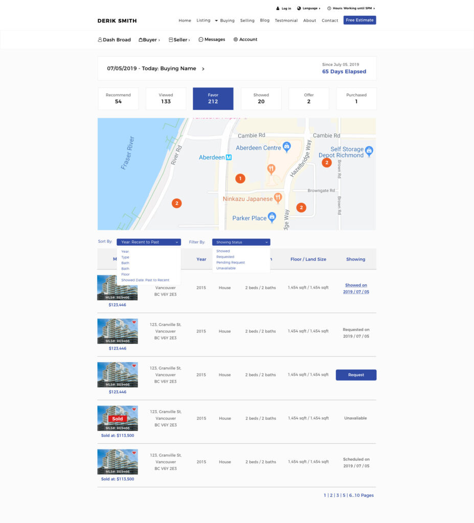
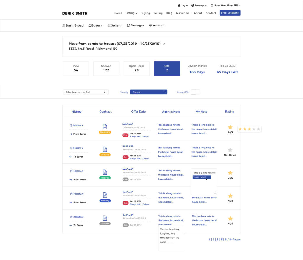
Especially the offer page that needs to show a contract offer with the different status like pending, accepted, countered or declined. Other features such as showing different clients, making a note or rating could be the possible challenges to display on one single page. I tried to shorten up the names and made icons and colourful status to avoid a tedious page. I hided many interactive features such as the dropdown list, popup window, on-off button for sorting and the multiple pages at the bottom to make the page looks clear. Although this page contained many information, I used the UX strategy to make a clear move of interaction and an easy understanding layout.
Challenge
Initially, it was challenging to understand the realtors’ needs despite receiving their feedback. We had to prioritize and simplify features to address key pain points, but our lack of experience caused delays. The rushed first version had design issues, requiring CSS adjustments during development. Each feature took about a month to develop, test, and revise. To avoid miscommunication, we ensured alignment through constant discussion, considering pros and cons. Over a year, we refined the product, improved teamwork, and I grew as a confident designer, adept at problem-solving and delivering value.
Reflection
Through this project, we realized the need for better team communication and management. Initially, designing separately caused inconsistencies, so we regrouped and created a unified design system. We took a month to establish a standard, with 4 designers collaborating on various concepts to build cohesive website blocks. This process improved our design workflow, ensuring future consistency. The effort led to smoother collaboration, and both developers and managers appreciated the streamlined approach, setting a foundation for efficient design and development in future revisions.
